A failed venture & learning experience
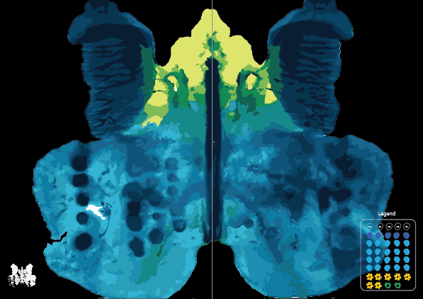
We use coloured ink istead of just black and white. We created organic shapes as our symbols and colour code it accordingly so that the users are able to see the ratio of the colours blended into the artwork.
we have decided to just use organic shapes and shape it into the meaning of the word. The symbols are designed to be very clean and simple because when inked, it will somewhat be smudged and blended into the rest of teh colours. This forms the overall abstract design.
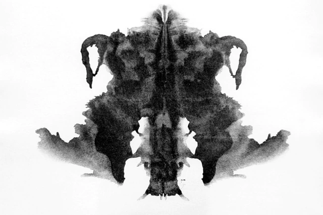
In drawing inspiration from the Rorschach test, our decision to utilize organic shapes in the formation of symbolic representations adds a layer of psychological depth to the visual language. Much like the Rorschach test, where individuals interpret ambiguous inkblots, our organic shapes invite subjective interpretation and evoke a personal connection with the symbols based on our data points.